Shopify Conversion Rate Optimization Guide

Shopify conversion rate optimization is all about turning more of your website visitors into actual customers. It’s a methodical process of figuring out how users behave on your store, testing changes, and smoothing out every step of their journey. The goal? Increase the percentage of visitors who click that "buy" button.
The beauty of this is that even small tweaks can lead to a huge boost in revenue—all without spending another dime on getting more traffic.
What Is a Good Shopify Conversion Rate?
Before you start changing buttons and rewriting copy, you need a target. What are you even aiming for? A "good" conversion rate isn't some universal number. It’s a moving target that shifts based on your industry, where your traffic is coming from, your average order value, and even the time of year. Chasing a random percentage you saw in an article is a recipe for frustration.
The real goal is to figure out your store's baseline and then focus on making consistent, measurable improvements from there. Knowing the general benchmarks just helps you set goals that are both ambitious and achievable.
Understanding Industry Benchmarks
It’s easy to get sidetracked by flashy case studies of stores converting at 10% or more. While that’s possible in some very specific niches, it's definitely not the norm. Grounding your expectations in reality is the first real step to a smart optimization strategy.
Looking at the data from thousands of stores, the average Shopify conversion rate hovers around 1.4%. But that number doesn't tell the whole story. The bottom quarter of merchants often see rates below 1.0%, while stores that have the basics down usually land between 2.0% and 2.5%. You can dig deeper into Shopify conversion rates for 2025 to see how these numbers break down.
The key takeaway is this: A small lift can have a massive financial impact. A store with 10,000 monthly visitors and a $75 average order value would jump from $10,500 in monthly revenue at a 1.4% conversion rate to $37,500 at a 5% rate—a 257% increase from the same traffic.
Context is everything. What's considered an amazing conversion rate in one industry might be just average in another. For example:
Fashion & Apparel: These stores typically see rates between 1.2% and 2.8%. Shoppers tend to browse a lot before they commit.
Electronics: This category can pull higher rates, often in the 2% to 4% range, especially for popular brands or highly specific products.
Health & Beauty: This is often a top-performing sector, with rates from 3% to 6%, thanks to high-trust products and lots of repeat customers.
To give you a clearer picture, here’s a breakdown of what you can expect across different e-commerce sectors on Shopify. Use this to set a realistic starting point for your own store.
Shopify Conversion Rate Benchmarks by Industry
This table provides average conversion rate ranges for various e-commerce sectors on Shopify, helping you set realistic optimization goals for your specific niche.
Industry | Average Conversion Rate Range | High-Performer Conversion Rate |
|---|---|---|
Fashion & Apparel | 1.2% - 2.8% | 4.5%+ |
Health & Beauty | 3.0% - 6.0% | 8.0%+ |
Home & Garden | 1.5% - 3.2% | 5.0%+ |
Electronics | 2.0% - 4.0% | 6.5%+ |
Food & Beverage | 2.5% - 5.5% | 7.5%+ |
Sports & Outdoor | 1.8% - 3.5% | 5.5%+ |
Remember, these are just benchmarks. Your store's performance will depend on your unique brand, audience, and marketing efforts. The goal is to understand where you stand and identify opportunities for growth.
Calculating Your Conversion Rate
Finding your store's conversion rate is simple. Shopify actually shows you this right in your analytics dashboard, but it’s helpful to know the math behind it.
Conversion Rate = (Total Number of Orders / Total Number of Sessions) x 100
So, if your store had 500 orders from 25,000 sessions last month, your conversion rate is (500 / 25,000) x 100 = 2.0%.
It’s really important to use "sessions" (which are essentially visits) instead of "users" (unique visitors). Why? Because the same person might visit your site a few times before finally buying something. This is the standard formula used by platforms like Google Analytics, so it keeps your data consistent.
This chart really puts the potential of optimization into perspective.
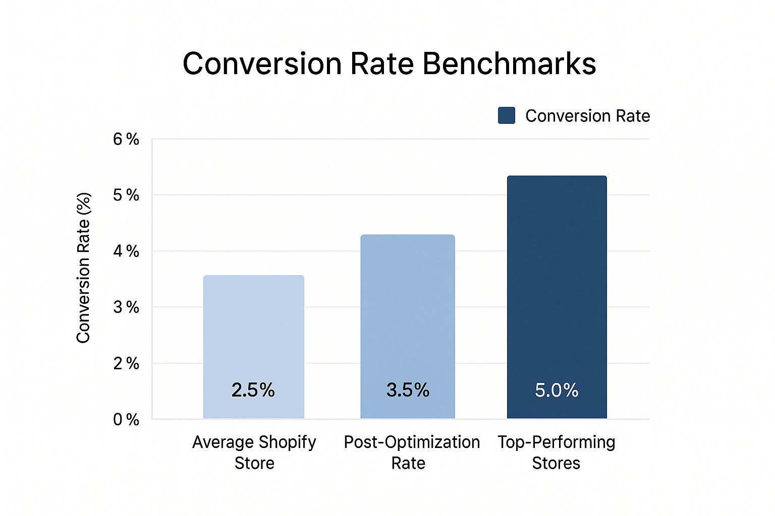
As you can see, moving from "average" to "optimized" can more than double a store's performance. This is the tangible goal of your Shopify conversion rate optimization efforts—to close that gap and capture revenue that's currently slipping through the cracks.
Finding the Leaks in Your Conversion Funnel
Trying to boost your Shopify store's conversion rate without a plan is like throwing darts in the dark. You might get lucky, but you'll probably miss the mark. Forget about randomly changing button colors or copying what a competitor is doing. The real pros treat this like a science—a diagnostic process to find exactly where your customers are dropping off and, more importantly, why.
Your standard Shopify dashboard gives you the basics, which is a decent start. But to really get to the bottom of things, you need to upgrade your toolkit. Think of it as going from a simple street map to a full-blown GPS with live traffic data.
See Your Store Through Your Customers’ Eyes
Before you can fix the problems, you have to see them. I mean literally see them. This is where you have to stop looking at spreadsheets and start watching what real people are doing on your site.
Qualitative analytics tools are your best friends here. They help you understand the human behavior behind the cold, hard numbers.
Two tools I absolutely swear by are:
Heatmaps: These give you a visual, color-coded map of where people are clicking, moving their mouse, and scrolling on your pages. A heatmap can instantly show you that your most important call-to-action is being completely ignored or that people are trying to click on a fancy graphic that isn't actually a link. That’s a clear signal your design is confusing people.
Session Recordings: This is like looking over a customer's shoulder as they browse your store. You can watch them hesitate, get frustrated and rage-click a broken link, or struggle to find your shipping policy. Honestly, watching just five or ten of these recordings can give you more actionable insights than staring at a data table for an hour.
These tools build empathy. You stop thinking of "users" and start thinking of "customers." For example, a session recording might reveal that your new pop-up is impossible to close on a smaller mobile screen, causing visitors to just give up and leave. You’d never spot that problem in a standard analytics report.
Map Out Your Customer Journey
While watching individual sessions is great for finding specific usability bugs, you also need the 10,000-foot view. This is where a conversion funnel analysis comes in. It maps out the main steps a shopper takes to make a purchase and shows you exactly how many people bail at each stage.
For most Shopify stores, the funnel is pretty straightforward:
Visitor lands on a product page.
They add an item to their cart.
They proceed to checkout.
They complete the purchase.
You can build a funnel report for free using a tool like Google Analytics 4 (GA4). Imagine your report shows that 90% of people who add an item to their cart start the checkout process. Great! But then it reveals that only 40% of those who start the checkout actually finish it.
Boom. You just found your biggest leak. Your problem isn't on your product pages; it's somewhere in your checkout flow.
Visualizing your funnel stops you from wasting time and money "optimizing" pages that are already doing their job. You can laser-focus your efforts on the one leaky bucket that's costing you the most money.
Slice and Dice Your Data for Hidden Clues
All visitors are not created equal. If you lump everyone together in your analysis, you're going to miss some huge opportunities. You need to segment your data—break it down into smaller groups to see how they behave differently.
Here are a few of the most powerful segments to look at:
New vs. Returning Visitors: It’s common for returning visitors to convert at a higher rate. If yours aren’t, that could be a red flag about your product quality or the post-purchase experience you're providing.
Traffic Source: Are the people coming from your Instagram ads behaving the same as those from a Google search? Knowing the answer helps you create better, more relevant landing pages for each audience.
Device Type: This one is huge. If you see a massive drop-off rate on mobile during the checkout stage, you almost certainly have a design or usability issue that’s making it hard for people to buy from their phones.
Data-driven approaches like these are the backbone of smart conversion optimization. A simple but effective starting point for many merchants is just separating new and returning visitors. It’s been shown that repeat buyers can spend up to 67% more than first-time customers, so it's a critical group to understand and cater to. You can dig deeper into these numbers by checking out these key Shopify statistics on conversion rates.
This kind of focused analysis leads to much more effective changes and, ultimately, a healthier bottom line. For more guidance on growing your business, check out our in-depth resources for sellers on ecommerce.co.
Designing Product Pages That Persuade and Sell
Think of your product page as the final, most important sales pitch. It’s that make-or-break moment where a curious browser decides to pull out their wallet and become a customer. Every single element, from the headline down to the "Add to Cart" button, has a job to do in your Shopify conversion rate optimization strategy. This is where you close the deal.
A truly persuasive product page anticipates and answers every question or hesitation a customer might have. It doesn’t just list features; it tells a story, builds a foundation of trust, and makes the purchase feel like the most natural, obvious decision in the world.
Craft Compelling Visuals and Descriptions
Let's be honest, people buy with their eyes first. Since they can't physically touch or hold your product, your visuals have to do all the heavy lifting. Grainy, single-angle photos are a conversion killer—they just scream "unprofessional" and leave shoppers guessing about crucial details.
You need to invest in high-resolution photography that shows your product from every possible angle. Mix in some lifestyle shots of the product in action, get close-ups on the important details, and if you can, create a short video. A well-made product video can boost conversions by 80% or more because it demonstrates value and builds confidence in a way that static images just can't match.
Once your visuals are dialed in, it's time to work on your copy. Rewrite your descriptions to focus on the benefits, not just the specs. For example, instead of saying, "Made with 100% merino wool," try something like, "Stay warm without the itch, thanks to our ultra-soft merino wool." See the difference? That simple shift connects a feature (the material) directly to a customer's desired outcome (comfort).
A great product description doesn't sell a product; it sells a better version of the customer. It speaks directly to their pain points and positions your product as the solution they've been searching for.
Harness the Power of Social Proof
Here’s a simple truth of e-commerce: shoppers trust other shoppers infinitely more than they trust brands. That’s the psychology behind social proof, and it's one of the most powerful conversion tools you have. Weaving genuine customer feedback into your product pages isn't just a nice-to-have; it's non-negotiable.
Here are a few essential types of social proof you should feature:
Customer Reviews and Ratings: Make sure star ratings are displayed prominently, right near the product title. Feature a good mix of detailed written reviews—and don't be afraid of a few constructively critical ones. It adds a layer of authenticity that perfect-five-star scores can't.
User-Generated Content (UGC): Encourage your customers to share photos of themselves using your products. A gallery of real people enjoying what you sell is incredibly persuasive and helps new shoppers visualize themselves with the item.
Testimonials and Endorsements: Pull out the most glowing quotes from customers or any endorsements you have from respected figures in your niche. Feature them in a visually distinct blockquote so they really pop.
By strategically placing these elements on the page, you build a powerful case for your product's quality and reliability. This goes a long way in easing the natural anxiety of first-time buyers. As you evaluate which tools can help, you can explore various options, including the different plans and features outlined in this pricing guide for e-commerce platforms.
Create Urgency and a Clear Call to Action
After you've done the hard work of persuading a shopper, you have to give them a clear, unmissable next step. A weak or hidden call-to-action (CTA) introduces friction and can easily lead to a lost sale. Your "Add to Cart" button needs to be the most obvious thing on the page.
Your CTA button should be:
Prominent: Use a color that contrasts with the rest of your page design so it stands out.
Clear: Stick with simple, action-oriented text like "Add to Cart" or "Buy Now." No need to get clever here.
Above the Fold: A customer shouldn't have to scroll to find the button. Make it visible as soon as the page loads.
Alongside a strong CTA, you can introduce a bit of ethical urgency to nudge customers who are on the fence. This isn't about using fake countdown timers or high-pressure tactics. It's about giving them helpful information that encourages an immediate decision.
For example, a simple low-stock alert like "Only 3 left in stock!" can tap into the fear of missing out (FOMO) and motivate a purchase. Likewise, a clear shipping deadline like "Order within 2 hours for same-day shipping" can be a fantastic incentive. If you want to dive deeper into modern techniques, exploring product page optimization with AI can provide some advanced strategies for maximizing impact.
Streamlining Your Checkout to Reduce Abandonment
This is it—the moment of truth. The checkout page is where a curious browser either becomes a happy customer or just another cart abandonment statistic. I've seen it time and time again: a clunky, confusing, or sketchy-looking checkout is the fastest way to kill a sale. This final step is arguably the most important part of the entire buying journey, making it a goldmine for your Shopify conversion rate optimization efforts.
Think of your checkout like the final 100 meters of a race. You wouldn't suddenly throw up a bunch of hurdles and confusing signs right before the finish line, would you? Our mission here is to pave a smooth, trustworthy, and fast path straight from the shopping cart to that sweet "Order Confirmed" screen.

Ditch the Friction with Simpler Forms
Every single field you ask a customer to fill out is another chance for them to hesitate and bounce. I can't tell you how many stores I've audited that force account creation on a first-time buyer. It’s a massive, unnecessary roadblock.
Always, always offer a guest checkout option right up front. It's perfect for new shoppers who aren't ready to commit or anyone who's in a hurry. From there, trim the fat from your forms. Only ask for the absolute bare minimum you need to process and ship the order.
Here are a few high-impact tweaks I always recommend:
Turn on address auto-completion. This is a small thing that makes a huge difference, especially on mobile. It cuts down on typos and speeds everything up.
Consolidate steps where you can. A single-page or accordion-style checkout feels much faster and less intimidating than clicking through multiple pages.
Use crystal-clear field labels. "Apartment, suite, etc." is so much better than the ambiguous "Address Line 2." Don't make them think.
Build Rock-Solid Confidence with Trust Signals
As customers pull out their credit cards, their anxiety spikes. They're about to trust you with sensitive financial data, and they need to feel 100% secure. This is where visual trust signals are your best friend.
Make sure the logos of payment methods you accept—Visa, Mastercard, PayPal, and so on—are prominently displayed. Add security badges from your SSL certificate (like "Secure Checkout") to visually reassure them that their connection is encrypted and their data is safe.
A well-placed trust badge isn't just a pretty icon. It's a visual handshake, a promise that your store is legitimate and their information is protected. This tiny detail can absolutely be the tipping point for a hesitant buyer.
Transparency is also a huge part of this. Make sure your shipping policy and a simple, easy-to-read privacy policy are easy to find right from the checkout page.
End Sticker Shock and Offer Flexible Ways to Pay
You know the number one reason people abandon their carts? Unexpected costs. I’ve seen data showing that surprise fees cause over 50% of carts to be abandoned. Someone might be thrilled with their $50 product, but a surprise $15 shipping fee at the last second feels like a bait-and-switch.
Be upfront about shipping costs long before the final step. A shipping calculator on the cart page or clear rates on product pages manages expectations and stops that last-minute sticker shock in its tracks.
Finally, you have to cater to how people actually buy things today. To really boost conversions, you need more than just traditional credit card fields.
I've put together a quick checklist of the most effective tactics I've seen work for reducing friction at this crucial stage.
High-Impact Checkout Optimization Tactics
Tactic | Primary Goal | Implementation Difficulty |
|---|---|---|
Enable Guest Checkout | Reduce friction for new customers | Easy |
Add Express Payments | Increase speed and convenience | Easy |
Display Trust Badges | Build security and confidence | Easy |
Show Shipping Costs Early | Prevent surprise fees and abandonment | Medium |
Simplify Form Fields | Minimize effort and user frustration | Medium |
Integrating express checkouts like Shop Pay, PayPal, and Apple Pay is a non-negotiable in today's market. These options let customers fly through checkout in seconds using their saved info. This is a game-changer for mobile shoppers who have zero patience for manually typing in their address and credit card number.
The takeaway is simple: the easier you make it for people to give you their money, the more of them will.
Recovering Sales with Smart Pop-ups and Retargeting
Let's face a hard truth: most people who land on your Shopify store for the first time are just browsing. They’re not ready to buy, and that's completely normal. But this isn't a failure—it's actually a massive opportunity.
These indecisive shoppers and abandoned carts represent a pool of highly interested prospects. They just need a gentle nudge to come back and finish what they started. This is where you build your safety nets to re-engage them and claw back what would otherwise be lost revenue.
Using Pop-ups Without Annoying Your Visitors
I know what you're thinking. Pop-ups are annoying, right? They have a terrible reputation, but that’s only because most stores use them so poorly. When you do it right, they are an incredibly powerful tool for Shopify conversion rate optimization.
The secret is to stop thinking of them as interruptions and start seeing them as helpful, timely offers. Forget those obnoxious, full-screen pop-ups that blast a visitor the second they land on your site. That’s a surefire way to get them to click the 'back' button.
Instead, let's get smart about it. The best pop-ups are triggered by specific user behavior, and my absolute favorite is the exit-intent pop-up. It only appears when a visitor’s mouse moves toward the exit or back button, giving you one final chance to make a great impression.
Instead of just begging for an email, give them something truly compelling:
A 10% discount on their first order.
A free shipping code they can use right away.
A genuinely useful piece of content, like a style guide or a how-to PDF.
It's surprising how few stores get this right. Recent data shows that just 39.4% of top Shopify stores use pop-ups at all, even though they see an average conversion rate of a whopping 11.09% from them. You can dig into more of these compelling CRO statistics yourself, but the takeaway is clear: a well-timed, value-first pop-up is a huge competitive advantage.
Crafting an Effective Abandoned Cart Sequence
When someone adds an item to their cart, it’s the strongest buying signal you can get. If they walk away, you can't just let them go. An automated abandoned cart email sequence is your single best tool for bringing them back. This isn’t about spamming them—it's about gently reminding them what they left behind and helping them overcome any last-minute hesitation.
From my experience, a simple, three-part sequence works wonders.
1. The Gentle Nudge (Send 1-4 hours after abandonment): This first email is just a helpful reminder. The tone should be light and customer service-focused, not pushy. Something like, "Did you forget something?" or "Your items are waiting for you" is perfect. Always include images of the cart items and a big, clear button to complete their purchase.
2. The Reassurance (Send 24 hours later): If they still haven't bought, it's time to build a little more trust. Maybe they're on the fence. You can introduce social proof, like a stellar review for a product in their cart. Or you could remind them of your hassle-free return policy to remove any perceived risk.
3. The Final Offer (Send 48-72 hours later): This is your last shot, so it's time to bring out an incentive. A small discount or a free shipping code can create just enough urgency to get them over the finish line. I like to frame it as a special, limited-time offer just for them.
Your abandoned cart emails should feel less like a marketing blast and more like a personal assistant helping a customer complete a task they already started. Keep the copy concise, mobile-friendly, and focused on making it as easy as possible to return and buy.
Common Questions About Shopify CRO

As soon as you start digging into Shopify conversion rate optimization, the questions start piling up. It's completely normal to wonder where you should even begin, what actually moves the needle, and how to get the most bang for your buck.
Let's clear the air. This section tackles the most common questions I hear from fellow merchants, giving you straightforward answers to help you build a smarter CRO strategy.
What Are the First Changes I Should Make to Improve Conversions?
When you're just starting out, the sheer number of "optimization" tips can be overwhelming. My advice? Forget about complex testing for now and focus on the low-hanging fruit. These are the quick wins that fix the most common reasons people abandon their carts.
I always tell clients to start with these three areas:
Attack Your Site Performance: First things first, your store needs to be blazing fast, especially on mobile. A slow, janky experience is the fastest way to lose a sale before a customer even sees your products.
Rethink Your Product Presentation: Take a hard look at your product pages. Are your photos high-resolution and showing multiple angles? Do your descriptions just list features, or do they sell the benefits and solve a problem for the customer?
Simplify the Checkout Process: Don't make people jump through hoops to give you money. Enabling guest checkout and adding express payment options like Shop Pay or PayPal can make a huge difference by removing friction right at the finish line.
How Does Site Speed Affect My Shopify Conversion Rate?
Site speed isn't just some techy metric for developers to worry about—it's a massive conversion lever. The fallout from a slow site is immediate and painful. Time and time again, studies show that even a one-second delay in page load time can tank conversions by 7-10%.
Think about it from your customer's point of view. A slow-loading page feels unprofessional and frustrating. They'll assume your site is broken or untrustworthy and bounce before you have a chance to make your pitch.
To get faster, you should be compressing all your images, ruthlessly deleting any unused Shopify apps that are bogging down your store, and making sure your theme is built for performance. A snappy, responsive site is the bedrock of a good user experience. For a deeper dive, this guide on Shopify Conversion Rate Optimization offers some great techniques to improve performance.
When Should I Start A/B Testing on My Store?
This is a big one. A/B testing is an incredible tool, but I see so many merchants using it way too early. The biggest mistake you can make is trying to test changes without enough traffic to get reliable data.
To get statistically significant results, you need a decent volume of visitors and, more importantly, sales. My rule of thumb is to wait until you have at least a few thousand visitors and a couple of hundred conversions each month. Anything less, and you're just guessing.
If your store is new or traffic is low, your energy is much better spent on implementing proven best practices. Once you have a steady stream of customers, then you can start A/B testing things like headlines, call-to-action buttons, or promotional offers.
How Can I Build More Trust and Social Proof?
In e-commerce, trust is everything. Your customers can't see or touch the product, so you have to build that confidence through other means. It all comes down to transparency and validation from other shoppers.
The single most powerful way to add social proof is by plastering customer reviews and star ratings all over your product pages. Make asking for reviews a non-negotiable part of your post-purchase email sequence.
Here are a few other trust-builders I swear by:
Encourage User-Generated Content (UGC): Actively ask customers to share photos of themselves with your products on social media. It’s authentic and incredibly persuasive.
Be Radically Transparent: Make sure your shipping and return policies are crystal clear and easy to find. Adding secure payment badges to your footer and checkout page also helps.
Stay Active and Engaged: A professional social media profile that’s updated regularly shows that a real, engaged business is behind the website.


