how to improve ecommerce conversion rate: 5 proven tactics

To get more sales, you first need a solid grasp of where you stand right now. This means calculating your current conversion rate and seeing how it stacks up against others in your field. It's not just about the final sale, though. You also need to look at the smaller steps customers take, like adding an item to their cart, to find out exactly where they're dropping off.
Analyzing Your Current Conversion Performance
Before you can start making improvements, you need a clear picture of your starting point. You simply can't optimize what you don't measure. Diving into your current performance is the first real step in any smart conversion rate optimization (CRO) plan, giving you the hard data you need to make changes that actually work.
A lot of store owners fall into the trap of chasing a vague "good" conversion rate without considering the context. A 2% conversion rate could be fantastic for a high-end furniture store but might be a red flag for a shop selling popular, low-cost gadgets. The goal is to get past that one big number and understand the story behind it.
Understanding Your Starting Point
The basic calculation is simple: divide your total number of sales by your total number of website visitors over a set time, then multiply by 100 to get your percentage. So, if you made 100 sales from 5,000 visitors last month, your conversion rate is 2%.
But that top-level number is just the beginning. The real insights come when you start slicing up the data. How do mobile users convert compared to desktop users? Are visitors from your email list buying more than those from your social media ads? Answering these kinds of questions helps you find what's working and, more importantly, where the biggest opportunities for growth are. To get a complete picture, it's essential to track the 10 Key Ecommerce Performance Metrics Shopify Brands Must Track to properly assess where you stand.
Benchmarking Against Industry Averages
Knowing your own numbers is one thing, but knowing how they compare to your competitors is another. In 2025, the average ecommerce conversion rate across all industries sits around 1.9%, but that figure can be pretty deceptive. Some sectors do much better—beauty and personal care can see rates as high as 6.8%. On the other hand, fashion retailers often average closer to 1.6%, and electronics stores land somewhere in the middle at about 3.6%. This just goes to show why comparing your store to a generic global average isn't very helpful.
This table highlights the significant variance in conversion rates across different ecommerce sectors, helping you benchmark your store's performance accurately.
Industry Sector | Average Conversion Rate |
|---|---|
Arts & Crafts | 4.0% |
Electrical & Commercial Equipment | 2.7% |
Pet Care | 2.5% |
Kitchen & Home Appliances | 2.5% |
Fashion & Apparel | 1.6% |
As you can see, what’s considered “good” varies dramatically from one industry to the next. Finding the right benchmark is key to setting realistic goals.
The infographic below really drives home the performance gap between different devices.
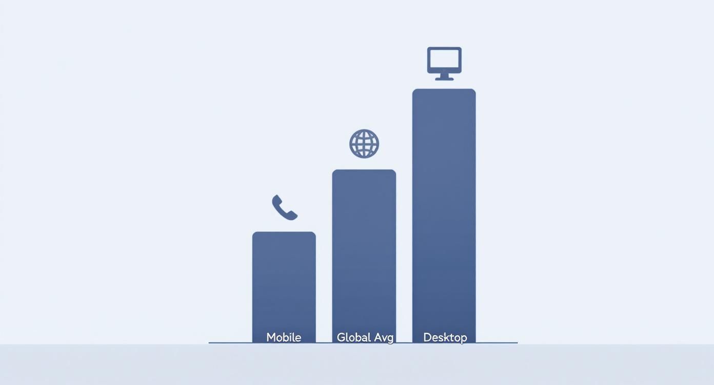
It’s clear that desktop users still convert at a much higher rate. This visual is a powerful reminder of why a mobile-first approach is no longer optional—it's essential for closing that gap and capturing more sales.
Looking Beyond the Final Sale
If you only focus on the final purchase, you're missing out on key clues about your customer's journey. You have to track the micro-conversions, too. These are the smaller actions that show a visitor is getting closer to buying.
By monitoring metrics like 'Add to Cart' rates, 'Checkout Started' percentages, and newsletter sign-ups, you create a detailed map of your sales funnel. This map reveals exactly where visitors are losing interest or encountering obstacles.
Think about it: if you have a great 'Add to Cart' rate but a terrible final conversion rate, the problem isn't your product pages. The issue is almost certainly lurking in your checkout process. Pinpointing these specific drop-off points lets you focus your energy where it will make the biggest difference to your revenue.
Creating a Smooth Path from First Click to Checkout
Think of your website as your best salesperson. If it’s confusing, slow, or hard to navigate, you’ve basically hired someone who mumbles and can't find anything in the stockroom. A frictionless user journey is all about methodically removing every single obstacle—big or small—that stands between a visitor and that checkout button.
Every second a user spends trying to figure out your site is a second they could be spending on a competitor's. The real goal is to make finding and buying products feel completely effortless. This process starts the moment they land on your site, long before they ever even see a product page.
Help Shoppers Find What They Want—Fast
Intuitive navigation isn't a "nice-to-have"; it's non-negotiable. If a visitor can't quickly figure out where to go, they will leave. It's that simple. We know that 32% of users are more likely to bounce if a page takes just three seconds to load, and confusing navigation creates a very similar level of frustration.
Your main menu needs to be clean, logical, and—most importantly—use the same words your customers would use. Forget generic labels like "Products." Get specific with categories like "Men's Hoodies" or "Kitchen Gadgets." This simple change directs people to the right place immediately, without any guesswork.
Beyond your main menu, a powerful site search is your secret weapon for a higher conversion rate. I've seen it time and time again: shoppers who use site search are usually much closer to buying because they already have something specific in mind. Make sure your search bar is prominent and loaded with helpful features.
Autocomplete Suggestions: As someone types, suggest popular products or categories. It speeds up their search and can even introduce them to items they didn't know you had.
Filters and Sorting: Let people narrow down their results by price, size, color, or customer rating. This gives them control and helps them find the perfect item without feeling overwhelmed by too many choices.
Smart "No Results" Pages: A search shouldn't lead to a dead end. Instead of just saying "nothing found," use that page to suggest popular products or offer alternative search terms.
When you make your products easy to find, you’re already halfway to a sale.
Design Product Pages That Actually Sell
The product page is where the real decision happens. It has to do more than just list features; it has to sell the experience and build absolute confidence in the buyer's mind. A great product page anticipates and answers every single question a customer might have before they even think to ask it.
The goal here is to eliminate any reason for a customer to hesitate. High-quality images, detailed descriptions, and totally transparent information all work together to remove doubt and make clicking "Add to Cart" the easiest decision they make all day.
Start with your visuals. You need high-resolution photos from every conceivable angle, plus some lifestyle shots that show the product being used in a real-world context. Even better? Add a short video demonstrating the product in action. Visuals communicate value much faster and more effectively than text ever can.
Next, nail your product descriptions. Go beyond the boring technical specs and explain the benefits. How will this product make the customer's life better, easier, or more enjoyable? I always recommend breaking up text with bullet points to highlight the key advantages—this makes the most important information easy to scan.
For a deeper look, you can find a ton of specific strategies in our guide to Shopify conversion rate optimization, which really gets into the nitty-gritty of product page layouts that are proven to work.
Put Your Mobile Experience First
In ecommerce today, your mobile site isn't just a shrunken-down version of your desktop site—it's your primary storefront. With mobile traffic dominating most online stores, a clunky, frustrating mobile experience is one of the fastest ways to kill your sales.
Adopting a mobile-first design philosophy means you design for the smallest screen first, then adapt the layout for bigger devices. This approach forces you to prioritize what’s truly essential, leading to a cleaner, more focused experience for all your users, not just those on their phones.
Here are the key things to focus on for a solid mobile user journey:
Large, Tappable Buttons: Make sure your calls-to-action and menu items are easy to hit with a thumb without accidentally tapping something else.
Simplified Forms: Only ask for the information you absolutely need at checkout. Every extra field is another chance for someone to abandon their cart.
Warp-Speed Load Times: Optimize your images and scripts to get your pages loading in under three seconds.
A Clear Visual Hierarchy: Use font sizes, colors, and spacing to guide the user's eye straight to the most important elements, like that "Add to Cart" button.
A seamless mobile experience shows customers you respect their time, and that trust translates directly into higher conversion rates.
Building the Trust That Drives Purchase Decisions
In e-commerce, trust is the invisible currency. A shopper can love your product, be impressed by your branding, and have their credit card ready to go. But if even a tiny bit of doubt creeps in, that sale is gone for good.
Building real credibility isn't a one-and-done task. It's about consistently showing your customers that you're a legitimate, reliable business that actually cares about their experience. Without that solid foundation, even the best marketing campaigns will fall flat.
Harness the Power of Social Proof
Here’s a simple truth: people trust other people far more than they trust brands. That's precisely why social proof is one of the most effective tools in your conversion toolkit. When a potential customer sees that others have bought from you and were happy with the experience, their hesitation drops dramatically.
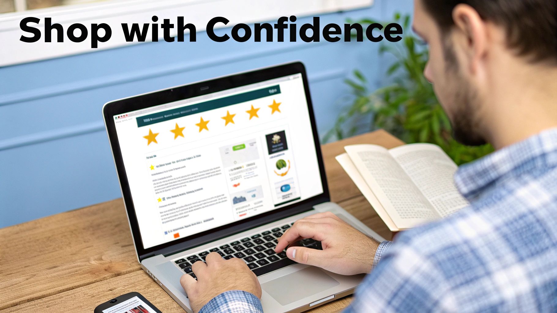
Genuine customer reviews are your most direct line to building this kind of proof. In fact, just displaying reviews can boost conversion rates by an incredible 270%. Don’t just tuck them away on a dedicated page; sprinkle star ratings and review snippets right onto your product and category pages where people can see them.
A quick tip from the trenches: authenticity is everything. A flawless wall of five-star reviews can actually feel a bit fake. A mix of mostly positive reviews with a few balanced, constructive ones comes across as much more genuine and relatable.
And don't stop at text reviews. User-generated content (UGC) is absolute gold. Encourage your customers to share photos of themselves using your products on social media with a unique hashtag. Featuring these real-world images on your product pages is powerful—it proves your items look just as amazing in a customer's home as they do in your professional photos.
Display Trust Badges and Security Seals
From the moment someone lands on your site, they're subconsciously scanning for signals that you're legitimate. This is where visual cues like trust badges come into play. They work as a mental shortcut, instantly telling shoppers that their personal and payment info is in safe hands.
Make sure these badges are front and center, especially near your "add to cart" buttons and throughout the checkout process.
SSL Certificate: That little padlock icon and "https://" in your URL are non-negotiable. It’s the universal sign of a secure, encrypted connection.
Secure Payment Logos: Showcasing logos for Visa, Mastercard, PayPal, or Apple Pay immediately tells people you work with established, trustworthy payment processors.
Third-Party Verifications: If you have them, badges from the Better Business Bureau (BBB) or security firms add another powerful layer of credibility.
Of course, these badges need to be backed by solid security measures. For a deeper dive into protecting your store, our guide on powerful ecommerce fraud prevention tools is a great resource for locking things down.
Be Radically Transparent
Nothing tanks a sale faster than a last-minute surprise, especially when it involves money. Being completely upfront about your policies is one of the easiest ways to build confidence and cut down on cart abandonment. Shoppers want clarity, not a scavenger hunt for crucial information.
Your shipping and return policies should be dead simple to find and understand. Don't bury this stuff in the fine print. Create a dedicated page, but also pull out the highlights—like "Free Shipping on Orders Over $50"—and feature them on your product pages or in a site-wide banner.
This transparency should extend to who you are as a brand. A thoughtful "About Us" page that shares your story and introduces the real people behind the business can forge a genuine human connection.
Finally, make it obvious how to contact you. Offering multiple ways to get in touch, whether it's by email, phone, or live chat, shows that you're an accessible, accountable business that isn't going to vanish once the sale is made.
Make the Checkout Experience Effortless
Think of your website as your best salesperson. If that’s the case, the checkout page is the final handshake that seals the deal. The problem is, for far too many online stores, this is exactly where the deal falls apart. A clunky, confusing, or untrustworthy checkout is the number one conversion killer, turning an almost-certain sale into just another abandoned cart.
The numbers don't lie. One of the single most effective ways to boost your e-commerce conversion rates is to tackle cart abandonment head-on. In 2025, the global cart abandonment rate is hovering around a painful 70-71%. That means for every ten shoppers who add an item to their cart, seven of them walk away. It gets even worse on mobile, where that rate can jump to a staggering 77%. You can dig deeper into these crucial ecommerce benchmarks and conversion statistics on Speedcommerce.com.
Every extra step you add, every confusing field, every moment of hesitation you create—it all directly increases the odds a customer will leave. Fixing this isn't a minor tweak; it's one of the highest-impact changes you can make to your bottom line.
Get Out of the Customer's Way
The golden rule of checkout design is simple: make it as easy as humanly possible for someone to give you their money. The biggest roadblock I see time and time again? Forcing people to create an account.
Seriously, demanding a new customer create a username and password before they can buy is a massive source of friction. They don't want another online account to manage; they just want your product.
The fix is straightforward: always offer a prominent guest checkout option. This simple choice respects your customer's time and can have an immediate impact on your abandonment rate. You can always ask them to create an account on the "Thank You" page after the sale is complete. The pressure is off, and they're much more likely to do it then.
Asking for too much information is another common mistake. Do you really need their phone number to ship a t-shirt? Is that second address line truly mandatory? Every extra field is another reason for someone to give up and close the tab.
Focus on Speed and Simplicity
Modern shoppers are conditioned to expect speed and convenience. They're used to one-click ordering and seamless payments, and your store needs to deliver that same experience. Integrating modern payment options is a great place to start.
Offer Digital Wallets: One-tap solutions like Apple Pay, Google Pay, and PayPal are non-negotiable today. They pull saved shipping and payment info, letting customers bypass all the tedious form-filling.
Show Their Progress: If your checkout has multiple steps, use a clear progress bar (e.g., Shipping > Payment > Confirm). This shows customers exactly where they are in the process and that the end is in sight, which makes the whole thing feel much faster.
Design Minimalist Forms: Use autofill wherever possible. A single "Full Name" field is almost always better than separate "First Name" and "Last Name" fields. Little details like this make a huge difference.
The entire flow should feel fast and intuitive. If a customer has to stop and think, you’ve created friction.
While platforms like Spocket or DSers are often mentioned for product sourcing, they don't solve these fundamental checkout problems. An all-in-one solution like Ecommerce.co is built differently. It not only helps you find quality suppliers but also gives you the framework to build a high-converting store from the ground up, with a buttery-smooth customer journey baked in.
Recover Sales You Thought Were Lost
Even with a flawless checkout, some people will still leave. It just happens. But that's where a smart recovery strategy comes into play, letting you reclaim a good chunk of that seemingly lost revenue.
Exit-intent popups are your first line of defense. When a shopper's cursor heads for the "back" button or to close the tab, a popup can appear with a small incentive—maybe 10% off or free shipping—to nudge them over the finish line.
For those who still leave, abandoned cart emails are your secret weapon. These automated messages remind shoppers what they left behind and give them a direct link to jump right back in and finish the purchase. There are tons of powerful ecommerce automation tools that can handle this for you, sending perfectly timed reminders to bring would-be customers back into the fold.
Using Personalization to Create Relevant Experiences

Let's be honest, today's online shopper has zero patience for a generic, one-size-fits-all storefront. They expect an experience that feels like it was built just for them. Moving away from a cookie-cutter approach and truly embracing personalization is one of the single most powerful ways to move the needle on your conversion rate.
This is all about using the data your visitors give you—what they look at, what they add to their cart, what they’ve bought before—to shape a shopping journey that speaks directly to their interests. When you show customers you get them, you build a connection that’s much stronger than a simple transaction. That’s how you build loyalty and drive more sales.
Make Every Recommendation Count
Dynamic product recommendations are the heart and soul of smart e-commerce personalization. Instead of showing every single visitor the same tired "Bestsellers" list, you can serve up suggestions based on what they're doing on your site right now.
Put yourself in their shoes. If a customer just spent five minutes browsing hiking boots, a carousel of "Boots You Might Like" is infinitely more helpful than a random display of your top-selling t-shirts. It makes the experience feel genuinely useful, not just like a hard sell.
By intelligently suggesting related products or items people often buy together, you’re not just increasing the chance of a sale—you’re also bumping up the average order value. The goal is to be a helpful guide, not just a storefront.
This is a strategy you can weave into several key areas of your site:
On Product Pages: Feature sections like "Frequently Bought Together" or "Customers Also Viewed."
On the Cart Page: Suggest logical add-ons or accessories right before they check out.
In Email Campaigns: Send follow-up emails with personalized picks based on their recent activity or past purchases.
Tap into the Power of Social Commerce
Your customers are already on Instagram, TikTok, and Facebook for hours every day. Why not meet them there? Social commerce turns that passive scrolling into an active shopping spree by embedding your products directly into your social feeds.
This isn't a small trend; it's a massive driver of sales. Social commerce and personalized marketing are exploding, with sales through social media channels projected to hit a staggering $1.17 trillion. Shoppers who come from social content can convert at rates up to 5.3 times higher than those from more traditional channels. It just goes to show the power of creating a frictionless path from social discovery to purchase.
For a deeper dive, check out these powerful ecommerce statistics and trends from SellersCommerce.com. To really get this right, you'll want to explore some of the dedicated ecommerce personalization tools to boost conversions that can automate these processes for you.
Move Beyond Generic Offers
Personalization is so much more than just product suggestions. You can—and should—tailor your offers, your content, and even the on-site messaging to different customer segments.
A first-time visitor, for instance, could be greeted with a welcome popup offering 10% off their first order. A loyal, returning customer, on the other hand, might see an exclusive offer based on their purchase history.
While dropshipping platforms like Spocket, Zendrop, or Autods.com are great for sourcing products, they often leave this crucial personalization piece of the puzzle up to you. They help you find what to sell, but they aren't built to help you create a fully optimized, high-converting customer journey.
This is where an all-in-one platform like Ecommerce.co really shines. It doesn't just simplify finding products from top-tier suppliers; it gives you the powerful framework you need to build a truly personalized shopping experience from the ground up. You can launch a store that's designed to convert from day one, with all the tools needed to create a relevant and engaging journey for every single customer.
Your Top Ecommerce Conversion Questions, Answered
As you start digging into conversion optimization, you'll naturally have questions. How long does this all take? What should I focus on first? Let's tackle some of the most common questions I hear from store owners.
How Long Until I See a Real Difference?
This is the big one, and the honest answer is: it depends. The timeline for seeing a better conversion rate is tied directly to how much traffic you get and how big of a change you’re making.
If you have a high-traffic store, a simple A/B test on something small—like your main call-to-action button—could give you a clear winner in just a couple of weeks. These are the quick wins that let you make smart, data-driven tweaks on the fly.
On the other hand, a major overhaul like redesigning your entire checkout process is a much bigger project. You're looking at several months before you can confidently say the changes are boosting your numbers. The trick is to think of this as a marathon of small improvements, not a sprint to find one perfect solution.
What’s the Single Most Important Thing for Conversion?
If I had to boil it all down to one word, it would be trust. It’s the bedrock of everything else. A shopper can be obsessed with your product, but if they get a weird vibe from your site or question its security, they’ll be gone in a heartbeat.
Trust isn't just one thing; it's a feeling you create with a combination of elements:
A Polished Design: Your site needs to look professional and legitimate.
No Surprises: Make your shipping and return policies easy to find and fair.
Security Badges: SSL certificates and familiar payment logos are non-negotiable.
Real Social Proof: Nothing beats genuine customer reviews, especially with photos.
Almost every optimization you make, from faster page speeds to a simpler navigation menu, helps build that sense of trust. Without it, all your other hard work can fall flat.
When shoppers feel secure, they don't just buy once; they come back again. Think of trust as a tool for retention, not just conversion.
Should I Prioritize Desktop or Mobile?
For nearly every online store out there, the answer is clear: mobile-first. Your analytics will probably show that most of your visitors are on their phones, but they convert at a much lower rate than desktop users. That gap is your single biggest opportunity.
When you nail the mobile experience—making it fast, smooth, and dead simple from the first tap to the final purchase—you’re solving the biggest problems for the majority of your audience. A great mobile design almost always scales up into a great desktop experience. The reverse is rarely true.
While product sourcing tools like Spocket or Zendrop can be useful for finding what to sell, they don't solve these core user experience issues. This is where an all-in-one platform like Ecommerce.co really shines. It's built from the ground up to help you create a store that’s optimized for mobile conversions right out of the box.
Ready to stop leaving sales on the table? With Ecommerce.co, you get access to vetted suppliers and the powerful tools needed to build a fully optimized, high-converting store. Start building your ecommerce business for free and see the difference an all-in-one platform makes.


